Understanding Color Psychology: How to Use Colors to Engage Your Audience
Understanding color psychology is essential for engaging your audience effectively. Colors evoke emotions and can influence a viewer's perception of your content, making it crucial to choose your palette wisely. For instance, red often evokes feelings of passion and urgency, making it ideal for calls to action, while blue conveys calmness and trust, which can enhance user engagement. Incorporating these psychological principles can enhance your website's design and help communicate your brand's message more effectively.
When designing your content, consider the emotional impact of color on your audience. For example, using warm colors like yellow and orange can create a sense of enthusiasm, while cool colors like green and purple can promote tranquility and creativity. A well-thought-out color scheme can also improve readability and accessibility for users. For a deeper dive into color choices and their implications, refer to reputable sources that focus on color theory and its application in communication and marketing.
Essential Tips for Creating a Cohesive Color Scheme for Your Website
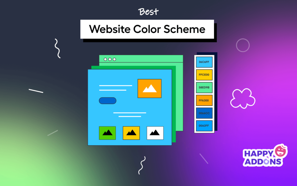
Creating a cohesive color scheme for your website starts with understanding the psychology of colors. Different colors evoke different emotions and responses, so it's crucial to choose shades that align with your brand identity and the message you want to communicate. For example, blue often conveys trust and professionalism, while green is associated with growth and tranquility. To get started, consider using online tools like Coolors or Adobe Color to generate palettes that resonate with your desired mood.
Once you've selected your primary colors, aim for a harmonious palette by incorporating complementary and analogous shades. Use a 60-30-10 rule as a guideline: 60% of your site should use the dominant color, 30% for the secondary color, and 10% for accent colors. This balance creates visual interest without overwhelming the viewer. Don't forget to test your color combinations for accessibility; tools like WebAIM's Contrast Checker can help ensure your text is readable against your background colors.
What Are the Best Color Combinations for Different Website Goals?
When designing a website, color combinations play a crucial role in achieving your specific goals. For example, if your objective is to generate leads, the combination of blue and orange can be highly effective. Blue instills trust and reliability, making it ideal for financial or professional services, while orange serves as an energetic and inviting accent that encourages action. Websites like Smashing Magazine discuss how these colors can increase conversions.
On the other hand, if your goal is to enhance user engagement on a blog or a creative portfolio, consider using purple and green. Purple evokes a sense of creativity and luxury, making it suitable for artistic websites, while green represents growth and harmony, enhancing readability. For examples of effective use of color schemes tailored to content-driven sites, check out Creative Bloq.
