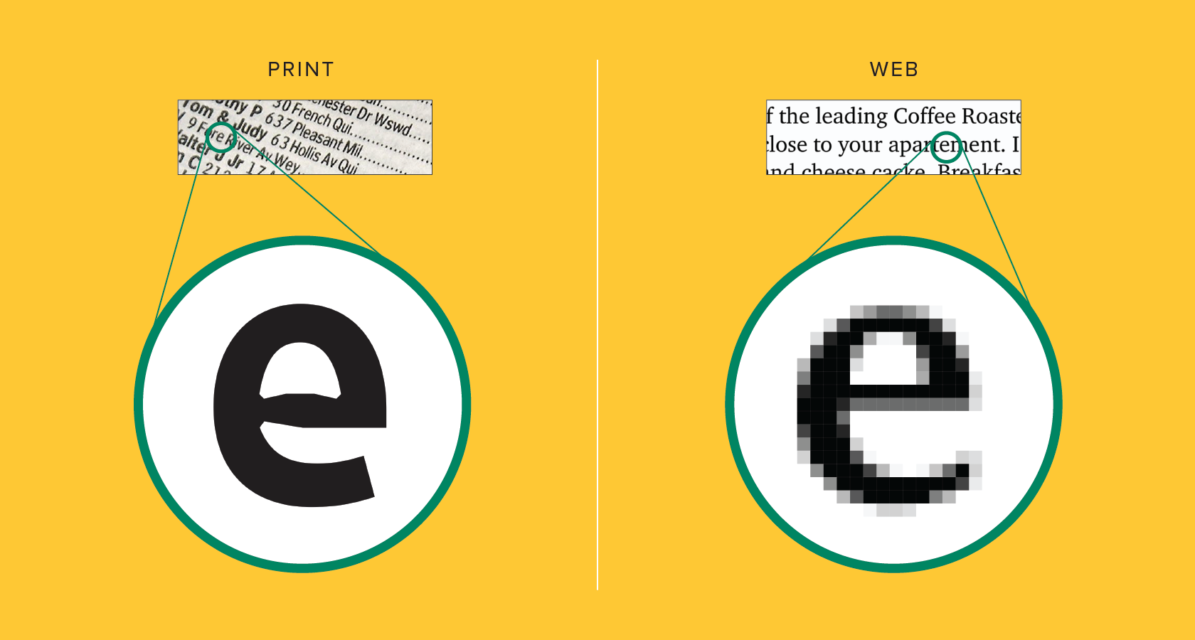
The Art of Readability: Choosing the Right Typeface for Your Website
Choosing the right typeface for your website is crucial in achieving effective readability. A well-selected typeface enhances user experience, making content easy to digest. Consider the font family and its characteristics; for example, sans-serif fonts like Arial and Helvetica often provide a clean look, suitable for modern web designs, while serif fonts like Times New Roman add a touch of elegance and are often used in more traditional contexts. When deciding on a typeface, think about your audience and the overall tone of your website. A balanced selection not only improves readability but also ensures your message is conveyed effectively.
Another important aspect to consider is the font size and line spacing. An optimal font size should be large enough to be easily readable on various devices, while sufficient line spacing helps prevent text from appearing cramped. It’s advisable to use a minimum font size of 16px for body text, while headings should be visually distinctive without overwhelming the reader. Contrast between the text and background colors is equally vital; ensuring high contrast enhances readability and makes the content more inviting. Always keep the user experience in mind and test your choices across different devices to ensure your typeface serves its purpose effectively.
Serif vs. Sans Serif: Which Typeface is Best for Your Web Design?
When it comes to web design, the choice between Serif and Sans Serif typefaces can significantly influence user experience and readability. Serif fonts, with their decorative strokes at the end of letters, are often associated with tradition and formality. They can enhance the elegance of a website, making them a popular choice for brands that want to convey a sense of history or authority. In contrast, Sans Serif fonts, which feature clean lines and no embellishments, provide a modern and minimalist aesthetic. These fonts are generally easier to read on screens, especially for long blocks of text, making them a preferred option for many web designers.
Ultimately, the decision between Serif and Sans Serif depends on the purpose and tone of your website. If your site aims to establish credibility and create a classic atmosphere, consider using Serif fonts like Times New Roman or Georgia. For a more contemporary feel that promotes accessibility and a clean look, go for Sans Serif fonts such as Arial or Helvetica. Remember, consistency is key; choose one typeface for headings and another for body text to enhance visual hierarchy and guide the user’s reading experience effectively.
Exploring Web Fonts: How to Enhance User Experience with Typography
Typography plays a crucial role in shaping the user experience on websites, and choosing the right web fonts can significantly impact readability and engagement. With a plethora of web font options available, designers can craft unique styles that resonate with their audience. For instance, using Google Fonts or Adobe Fonts allows for a diverse selection that can enhance the visual appeal of a site. It's essential to consider factors such as font size, line spacing, and contrast to ensure that your typography supports the overall design and accessibility goals of the website.
Incorporating web fonts is not just about aesthetics; it also contributes to the overall functionality of a website. A clean and legible font can reduce eye strain and improve the reading experience, especially on mobile devices where users often skim content. Additionally, when implementing web fonts, it’s vital to optimize loading times by choosing only the necessary font weights and styles. Responsive typography ensures that text looks great across all devices, providing a seamless experience that keeps visitors engaged and returning for more.
